Checks almost too pretty to cash?
Share
Story
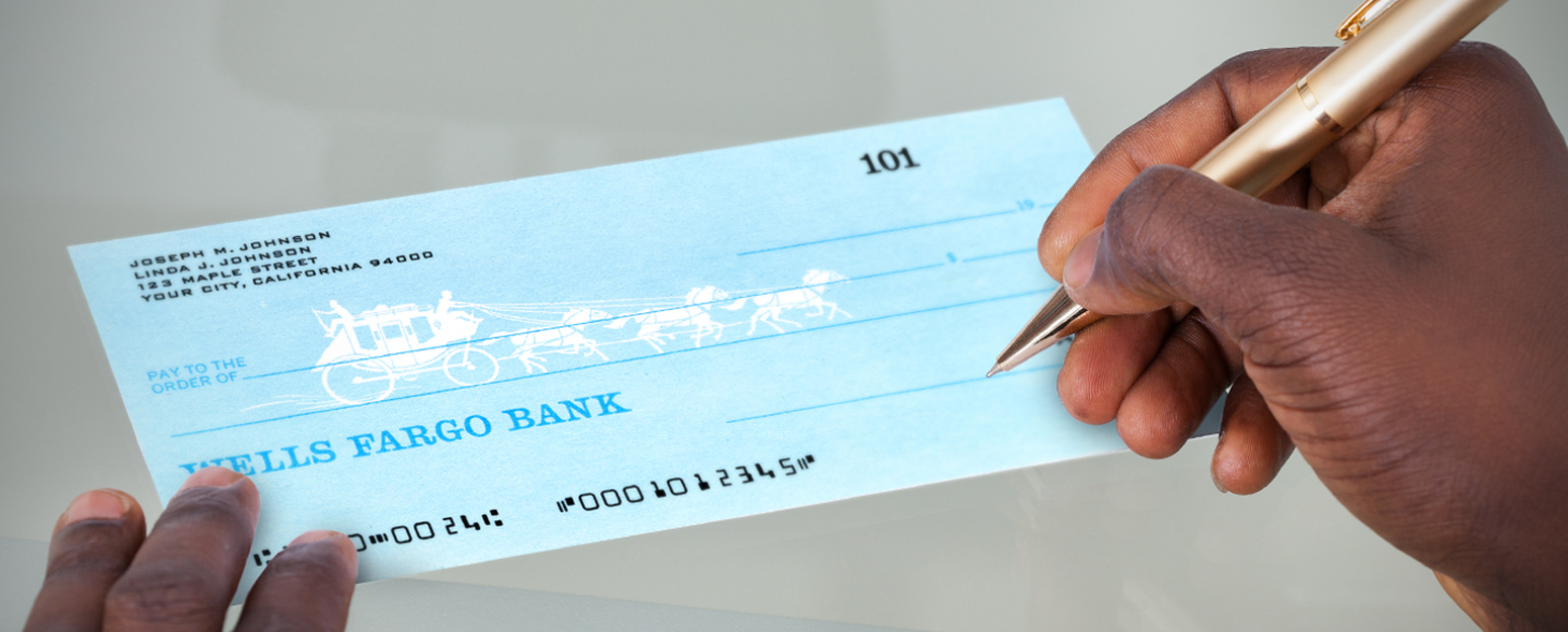
Wells Fargo customers today have a variety of colorful options when ordering a new checkbook or debit card, but it wasn’t always that way. The color and choice revolution started with Wells Fargo’s scenic stagecoach checks, introduced in the summer of 1967.
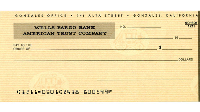
In the early 1900s, checks — operating as bank stationery rather than works of art or expression — typically featured a plain background and very little stylistic detail. Banks issued one standard check design for all customers.
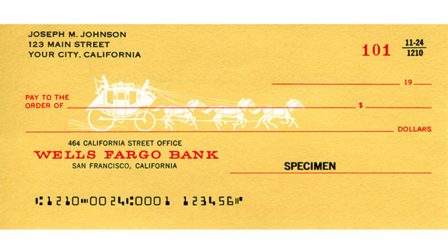
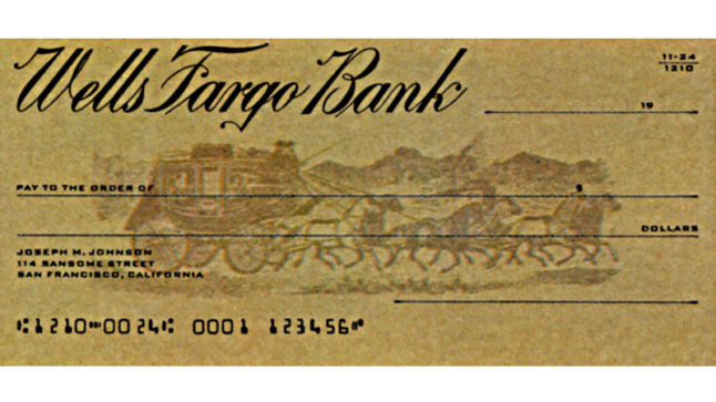
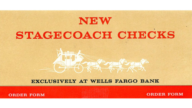
Wells Fargo realized there was customer demand to revolutionize the rather dull field of bank checks. In a first attempt to address this need, the company redesigned its checks in 1964, and began featuring a subtle white silhouette of an illustrated stagecoach against a blue or tan background in 1965. These checks drew attention from customers for having an element of fun, but the two-toned color scheme and muted design still didn’t stand out and set them apart from check options at other banks.
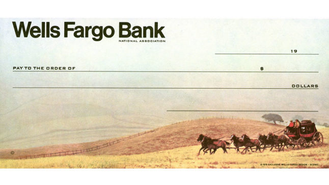
Everything changed when Wells Fargo released its first scenic stagecoach check in 1967. The full-colored check was a photo reproduction of a real stagecoach rolling over golden hills. The attention to detail and use of multiple colors stunned customers and competitors alike. Considered “almost too pretty to cash,” according to a customer in a 1967 press release, the checks became an instant hit. Never before had a check been so vibrant or so popular.
Advertised on billboards, television, and in magazines, the scenic stagecoach checks were so admired that people nationwide asked about purchasing them, even though Wells Fargo was only operating in California at the time.
Checks almost too pretty to cash?
(Background sound: horses galloping. Horses pulling a stagecoach with two men riding on top appear at a distance in a grassy meadow with a blue sky.)
hey-yeah
(Background sound continues: The narrator begins to speak.)
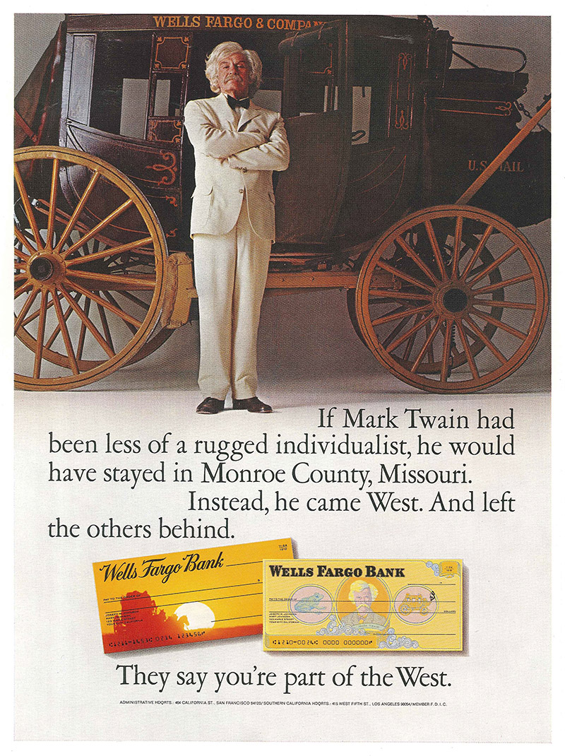
Wells Fargo Bank’s new character checkbook has the kind of men who came West and left the others behind. There’s Buffalo Bill from Scott County Iowa,
(Background sound continues: When the narrator says “… There’s Buffalo Bill from Scott County Iowa, …,” the shot zooms in closer on the two men. One is holding the reigns and driving the stagecoach, the other is holding a shotgun. The heads of the horses are close, and the camera pans left as the stagecoach passes by.)
Joshua Norton self-appointed Emperor of the United States, around the horn in ’49, Wyatt Earp out of Monmouth Illinois,
(Background sound continues: When narrator says “… Wyatt Earp out of Monmouth Illinois,” the shot changes to a wide view of the stagecoach and team of 6 horses galloping through a wide-open field. The grass in the field is brown and there is a big blue sky above. A few sparse trees are in the background.)
Mark Twain from Monroe County Missouri, and they are all on new character checks.
(When the narrator says, “and they are all on new character checks.” The horses and stagecoach stop their motion and the screen begins to narrow and a black frame appears around the image. The words Wells Fargo Bank appear in the upper left of the image and the whole image transitions into a stagecoach check. The background sound of horses galloping stops when the motion stops.)
Oh of course we still have Wells Fargo’s famous stagecoach checks.
(When the narrator says, “Oh of course we still have Wells Fargo’s famous stagecoach checks,” The check transitions to the upper right of the screen and three additional checks with stagecoach themes appear. They are grouped together and clockwise from top left are; A grey background with a white silhouette of the stagecoach and horses; the previously described stagecoach and horses in a open field; an orange check with the stagecoach and horses riding into a bright yellow sunset; and an orange check with the stagecoach and horses featured in the center of the check. On the bottom of the screen in the black framing, in white text, appears the words: “They say you’re part of the west.”)
A 1971 TV commercial for the scenic stagecoach check featured running horses, who wore makeup to resemble the horses on the checks, and a rolling stagecoach. Similar commercials ran from 1968 until the 1970s. (30 seconds) Photo Credit: Wells Fargo Corporate Archives.
Other banks soon followed Wells Fargo’s lead and began offering a variety of colorful checks that encouraged self-expression. As several newspapers, including Connecticut’s Hartford Courant, noted in 1971: “Since Wells Fargo Bank adorned its checks … with a picture of a stagecoach, checks have grown more colorful. Now they are printed with peace symbols or military insignia, depending on the customer’s viewpoint. Beach scenes, pop art, and floral patterns compete with sunsets, views of historical buildings, and famous landmarks on the face of multihued checks.”
The scenic stagecoach check started a frenzy of design creativity and Wells Fargo continued issuing new, attractive options for customers. Now customers can use designs inspired by artists or display one of their own unique creations.